Kitchen design

I saw a very upmarket kitchen design where there appeared to be an island prep table whose long side could be used as a breakfast bar.

However it was actually on trolley wheels and could be pushed against a wall when not in use. It had bins, cupboards and drawers on the working side. I remember olive oil and balsamic vinegar in one end, and utensils in wide drawers. There were cupboard doors on both sides. I copied this slightly in a kitchen with a peninsular dividing the cooking from the dining part of the room, with doors on the dining side of the unit giving access to shelves of glasses, cups, cookery books etc, and having a wide worktop you could push barstools under. As bought,the units had lightweght backs that needed to be clad or panelled, and were easily replaced with doors.

you do need a very large room to be able take up half of it with an island that you have to keep walking round.
 
It really depends whether you are actually a cook or not. The problem isn't so much the ability to extract- I'm sure the demonstrations are impressive, it's what happens in the extraction trunking. A long trunking going downwards extracting lots of water vapour and fatty smoke and vapour - what do you think is going to happen? If you are a keen cook, your extraction wants to be on an outside wall with the shortest trunking possible, otherwise condensation within the trunking combined with all the fatty deposits are not a good prospect for long term efficiency!

You hope the filtration will capture everything. You hope...

Why not delete the island, consider a G shaped design with everything around the walls and a sticky-out bar rather than two openings either side of the island. You then have an open work area with an unrestricted work triangle between cooker, fridge and sink. But there again, I just hate islands!!

We've got MVHR dealing with the filtered extract

Regards

Tet
 
I sincerely hope that you are incorrect. We went to a siemens downdraft demo in Central London and were very impressed with its extractive abilities. The Neff equivalent is an almost identical twin, made in the same factory

I can't comment on it in use yet, as we are about a month away from it being installed

Regards

Tet
Did the demonstration use 10” pans whose tops sit 8” above the stove.
Or did they use short pans .
Did they have a six ring range full of pans?
 
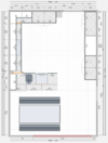
So for those of you suggesting a U-shaped layout, how about this? Fridge and freezer are still on the right bank at top.
Top-box for concealed extractor fan, single oven and microwave oven in tall cupboards, plus a corner tall larder for lots of space.

Screenshot 2024-07-06 at 16.25.17.png
diy-kitchens-Kitchen_U-Shape_tall_corner-2024-07-06 15_26.png
 
edited for extra content


why do you want the diners to be facing the kitchen sink, piled up with cooking pans and dirty dishes? A clear work surface is better.

What is the gap in wall A? A door way? Open plan access? People going through it will be obstructed when the cab doors are open and someone is standing or crouching at them. This is worse if they are frequently used.

For tall cabs, I greatly favour pull-out or swing-out shelves, wire racks or drawers making it easy to get the tabasco from the back even though it is hidden behind the cans of beans.

For tall wall units, you can get a pull-down rack that brings the top two shelves out and down by (I think) about 300mm, which is handy if your wife is not a giant. If she is, consider raising the worktop to her elbow height.Especially the sink which is usually positioned to make the user stoop.

I'd prefer to see the sink on wall A, with the hob, oven and fridge all adjacent, and the d/wr (for simplicity of plumbing) close to the sink. Where are the plumbing services?

Is there a boiler in the kitchen? It needs close access to an internal waste pipe for the condensate.

A useful tip is to wire cooker outlets on two opposite walls, for when you want to change the position of the hob and/or oven. I have that. Currently the "unused" cooker outlet gives a dedicated circuit that is used for the fridge-freezer, isolating it from RCBO trips on the socket circuit.
 
Last edited:
why do you want the diners to be facing the kitchen sink, piled up with cooking pans and dirty dishes?
I don't necessarily want them facing the sink, but equally would prefer to not have an extractor hanging over the peninsula...
 
the sink has less need for an extractor than the hob
 
have added more content to previous post

BTW I find pan drawers much better if they are 1000mm rather than two smaller ones. I have a Kenwood chef and accessories at the front of one, and there is plenty of room for large friers, colanders, sieves etc with long handles, which take up a lot of room in a smaller cab.
 
I have a U shaped kitchen and at the beginning I was opting for an island.
The large space in the middle is very convenient and makes the kitchen look bigger.
Also more space for cupboards.
In your design i see the left unit opening towards the dining area: I have done exactly that and use that corner for tea and coffee facilities.
The boss of the kitchen is pleased that I have no reason to go in her space...
The rest of the peninsula from the dining side should just be flat otherwise you'll lose space in the cupboards and those shelves will inevitably become cluttered with unsightly stuff.
Yeh, we're now leaning towards the u-shape layout for a lot of the same reasons...

Tea and coffee for us will be in the dresser unit on the right; plan is to make a butlers pantry style unit with pocket sliding doors..
 
Yeh, we're now leaning towards the u-shape layout for a lot of the same reasons...
I think it will feel roomier and easier to use.

I was thinking the opening between your cooking and dining areas could be more central.

I had one where it was to the side, like yours, due to the position of a door, and it did make you feel like you were walking round the end of the peninsular. Makes more sense if you want a barrier to small children or other undesirables. Kettle, paper towels etc were on a worktop corner accessible from both sides.
 
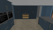
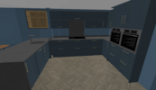
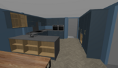
So have made yet more tweaks, this time removing the tall corner unit and instead fitting a pull-out corner base unit and l-corner wall unit, which just adds a little more worktop space.
Also moved the sink over to the left a bit more so it's not in the middle of the peninsula, and shortened the peninsula by 100mm.

This render also shows a quartz worktop, which we quite like, but not sure if can justify the extra cost yet....
diy-kitchens-Kitchen_U-Shape_3-2024-07-07 21_58.png
 
OK, I think we've got the layout down now...

Changes from previous:
* Replaced sink unit with a blind corner unit - idea being we can put the boiler/chiller and pipework in the blind side. This did require removing the HL cabinet on the opposite side of peninsula, but I think it's overall a better use of space.
* Shortened length of peninsula to line up with edge of units on opposite side of u, and increase gap between end and larder units.
* Replaced HL cabinet with open shelf unit
* Switched dresser unit for a full-depth, and we're planning on fitting pocket door slides to make it a butlers pantry unit.
* Switched combination oven housing for a single oven housing, as going to put a normal microwave in butlers pantry, and instead have 2 single ovens.

Comments/criticism welcome :D
 

Attachments

  • Screenshot 2024-07-12 at 22.24.15.png
    Screenshot 2024-07-12 at 22.24.15.png
    144.9 KB · Views: 24
  • diy-kitchens-Kitchen_U-Shape_3-2024-07-12 21_25 (1).png
    diy-kitchens-Kitchen_U-Shape_3-2024-07-12 21_25 (1).png
    641 KB · Views: 22
  • diy-kitchens-Kitchen_U-Shape_3-2024-07-12 21_25.png
    diy-kitchens-Kitchen_U-Shape_3-2024-07-12 21_25.png
    738.1 KB · Views: 26
  • diy-kitchens-Kitchen_U-Shape_3-2024-07-12 21_24.png
    diy-kitchens-Kitchen_U-Shape_3-2024-07-12 21_24.png
    796.8 KB · Views: 24
Where is the butlers pantry with the microwave? I still think a multifunction microwave is better, and some of them are quite big.

I think it will be difficult to reach into the wall cabs over the peninsular end, especially the top ones.

I'd prefer doors on the shelves of junk facing the table.

What are the shelves for, opposite the hob?
 
Back
Top